
Brand & Identity Work
Eleven identities designed for ventures, ministries, and side projects — all of it drawn in GIMP, in the years when I was not writing software for a living.
Across the years I spent outside software, a steady side stream of the work was visual identity — for my own ventures, for ministries, for projects that got as far as a name and a logo and no further.
All of it was drawn in GIMP, which is a slightly absurd tool for logo design and was the one I had. Working in a raster editor when the job wants vectors imposes a discipline: you commit early, you cannot casually rescale, and you learn to build a mark that survives being small.





A few of them
Digital Gospel is the one I would still defend. A cross assembled out of offset squares — pixels, deliberately — so that the mark says both things in the name at once without illustrating either. It came with a full front-page design and a QR code, which dates it precisely.
Epic Little Media Company solves the opposite problem. The wordmark is built from blocky letterforms with pieces knocked out, so a name containing the word little reads as something constructed rather than something small.
Shalom San Francisco is the most literal and the most local: the word set against the city's skyline, bridge included. Kingdom Digital goes the other direction, pairing a blackletter K with a plain modern sans — old authority next to new medium.
Art of Impact is a comet, drawn as a single confident stroke, on a flat blue field. Et Cetera was my own — a diamond of scattered outlined squares in four colors, for a project whose whole premise was that it was about whatever came next.
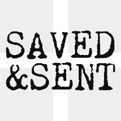
99Bots is a robot's face — two round eyes and a bar of teeth, in teal with a red plate slipped out from behind it, so a flat mark reads as two layers. It was the incubator name I filed ideas under; a 2012 profile of mine describes it as "an incubator for the dozens of ideas that come into my brain," which is about right for a brand whose main output was more brands. Saved & Sent sets a battered typewriter face into the negative space of a cross.
Three more came out of the venture years. Denizen Lab is a beaker, for the studio WP Launch Factory ran under — laboratory rather than agency, which was the whole positioning. Social For Nonprofits is a puzzle piece, for a venture selling social media help to organizations that could not afford an agency. DonorWorthy is two hands forming a heart, and it never got past the logo and a Bootstrap download.
What it taught
This is where the design half of how I work came from. Every product I have led since has needed someone in the room who could argue about a layout in the vocabulary designers actually use, and could then go build it. That did not come from a design education. It came from years of making marks for things nobody was paying me to make marks for, and finding out which ones held up.