
Amazon Amp
LaunchedDeprecatedAmazon's live radio app, where anyone could DJ their own show with a catalog of licensed music and take live calls — built from a functional prototype through launch and Discovery 2.0.
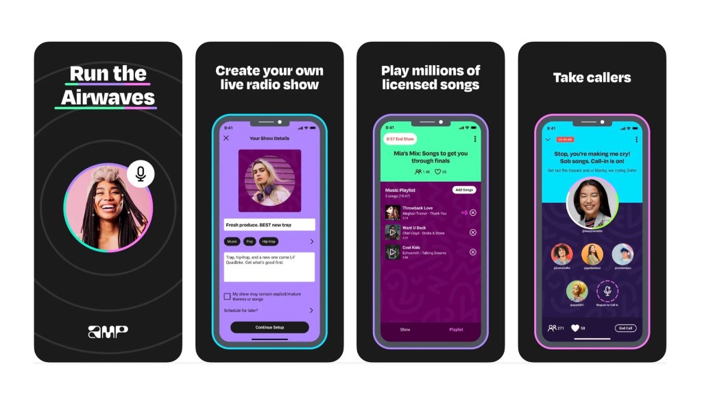
Amp was Amazon's attempt to reinvent radio: an app where anyone could host a live show, mix in music from a catalog of licensed songs, talk over it, and take live calls from listeners. It launched in March 2022 on iOS in the US as a limited-access beta, with shows from Nicki Minaj, Pusha T, Big Boi, Tinashe, Lil Yachty, Travis Barker, Lindsey Stirling, and radio hosts including Kat Corbett, Zach Sang, and Guy Raz. It shut down in October 2023.
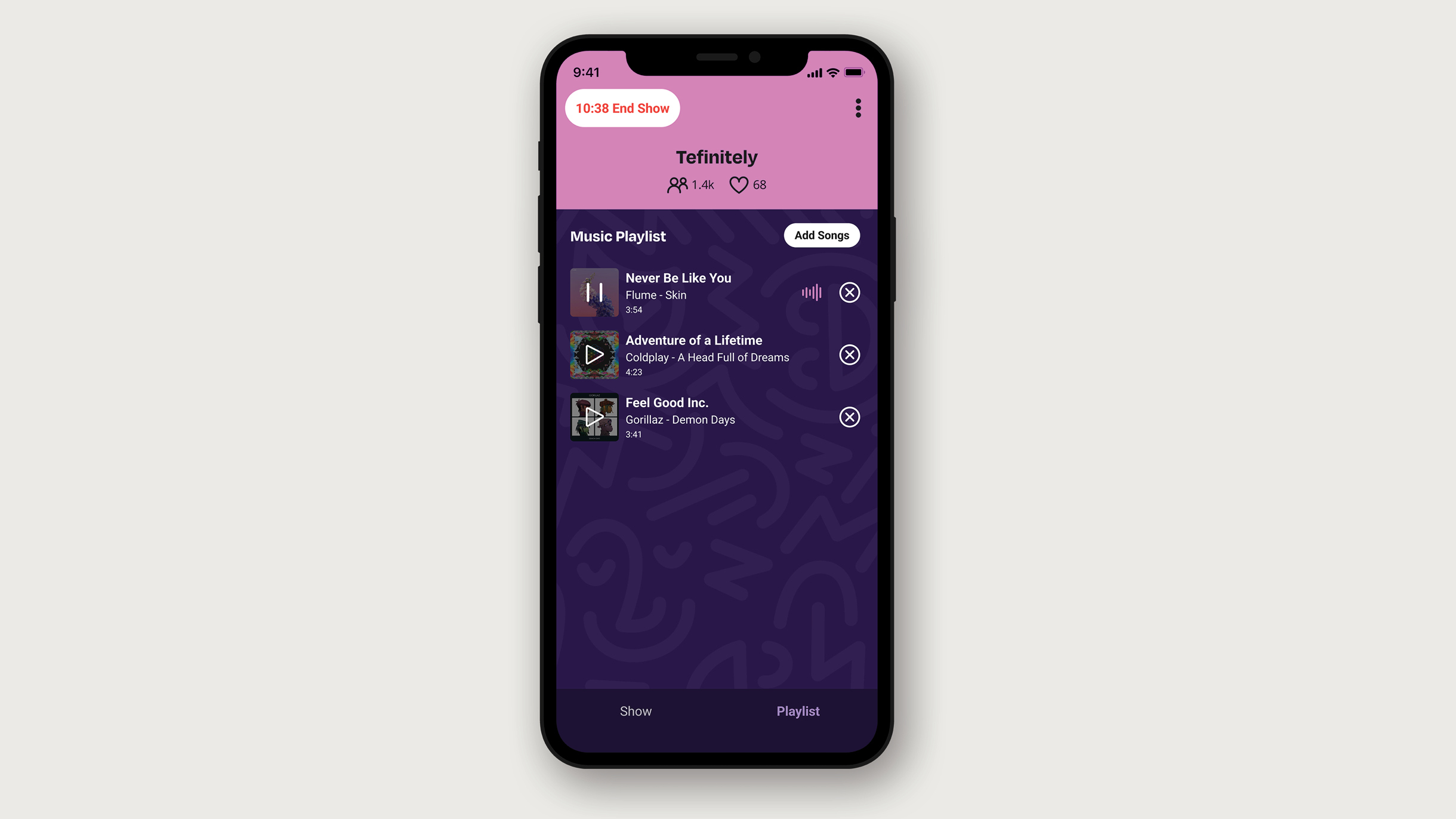
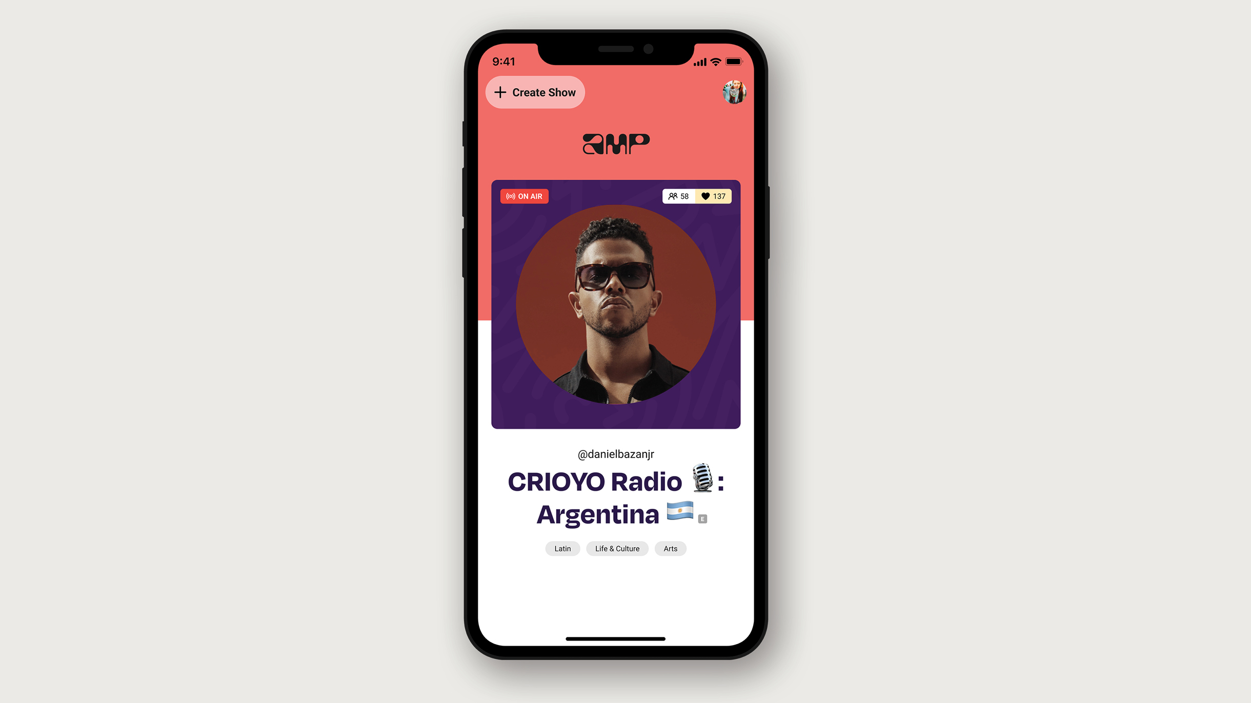
I joined Amazon Music at the very beginning of the project, while it was still codenamed Project Mercury and before there was an app at all, as a senior front-end engineer on the Design Engineering team, which sat at the intersection of product design and engineering. I was there from the first functional prototype through the launch and through the app's largest post-launch redesign.
The functional prototype
Before Amp was a product it was a question, and the question was whether this experience actually works. My first job was to build the answer to that question, which was a complete functional prototype of the app, written in React Native, that people could hold in their hands and use.
It was a real app rather than a click-through. The live audio ran on the Amazon Chime SDK, with a full show lifecycle on it, so that creators could schedule and start a show, and build and run a playlist against a music catalog, and manage the participants, and hand the microphone over to listeners who dropped in live. Listeners got a home feed, and a radio-dial browsing metaphor for skipping between live shows, and a persistent play bar and player, and creator profiles, and following. State ran through Redux with sagas driving the show flows and the playback flows and the drop-in flows, and the data came over GraphQL, and a native bridge connected the JavaScript to the containing app.
That prototype was how the team argued about the product, and that included the builds that went to leadership for the decisions that determined whether Amp got made at all.
The design system
As Amp moved from prototype to production, the shared React Native UI library went along with it. It began as the component package that the first feature teams consumed, and it became FluxusUI, which was the implementation of the Fluxus Design System, built and maintained by the Design Engineering team.
The structure is the argument. There were 3 layers, and which of those layers a thing belongs to is a real decision:
- Constants are the design language itself expressed as code, which is the typography, and the color, and the spacing, and the corner radius, and the breakpoints, and the icons and their sizing, and the tap targets, and the animation, and the background patterns, and the glass treatment.
- Elements are the primitives that each do one thing, which are text, and button, and pressable, and icon, and pill, and badges, and tags, and toggle, and overlay, and loaders, and logo, and notification bubble, and layout, and the animation wrappers, which are fader and rotater and fullscreen.
- Components are the elements composed into things that have behavior, which are bottom sheet, and side sheet, and dialog, and toast, and tooltip, and search bar, and text field, and list item, and pagination, and bottom tab navigator, and avatar and avatar cards, and short survey and survey question, and media layout, and then the pieces specific to live audio, which are show art, and track block, and sequencer, and time bar, and loading ring, and the speaking ring that showed who had the microphone.
That split is one of the library's stated tenets, which is that you start with simple components and then compose them into complex ones. The other tenets were that it flows from the design system rather than competing with it, and that it does not break its consumers, and that changes are reviewed and tested and documented, and that components are accessible out of the box rather than accessible on request, and that everything in it is discoverable, which meant a published Storybook carrying the usage docs, and a changelog, and a status-and-availability page, so that a feature team could see what already existed before they went and built their own.
A design system that isn't accessible and isn't documented isn't a design system at all, because it is only a style guide with a package name on it.
Discovery 2.0
Amp launched with a deliberately bold home screen, which showed a single show card at a time and was optimized for sampling audio rather than for the standard vertical scroll of a user-generated-content app. It was a real design bet, and the data said that the bet had not paid off, because a large fraction of new users never listened to or scrolled past the first card they saw. Customers had no way to browse for content that matched a mood or an interest.
Discovery 2.0 was the response to that, and it was the largest project I worked on at Amp, and its job was to unify home and search and a new deep-browse surface into one discovery experience. The single-card home list became a Show Tuner that was limited to the content you could listen to right now, which was live shows and replays and channels, with a peek at the adjacent card so that it read as browsable, and with richer metadata on each of the cards. Below it sat Explore, which was horizontal show carousels and creator carousels, and dynamic genre and topic pills computed from whatever was actually live in the catalog at that moment, and a "live soon" list, and vertical browse by category.
The whole thing was structured as parallelizable milestones that shipped to customers every 2 weeks, rather than as one large redesign landing all at once. Peers described it afterwards as a project that wouldn't have materialized without a relentless focus on shipping it, and that is the part I am proudest of, because the hard problem was never any individual screen.
Working at the seam
The role I actually played at Amp was the one that sat between the disciplines. Design Engineering meant turning concepts into working code fast enough that the team could evaluate them live and in a session, instead of arguing about static mockups for a week. It also meant being the person that designers and product managers asked what was feasible, and being the person that engineering teams borrowed for front-end problems across the app.
Press
- Amazon launches live audio app that lets users DJ their own radio show — CNBC
- Anyone can make a radio station on Amazon's new Amp app — Music Ally
- Amazon pulls the plug on Amp, the live-audio app it launched last year to 'reimagine radio' — GeekWire
- Amazon shuts down Amp live audio service — CNBC
- Amazon shutters its live radio app Amp — TechCrunch